Edizioni Enea
A very natural editorial restyling
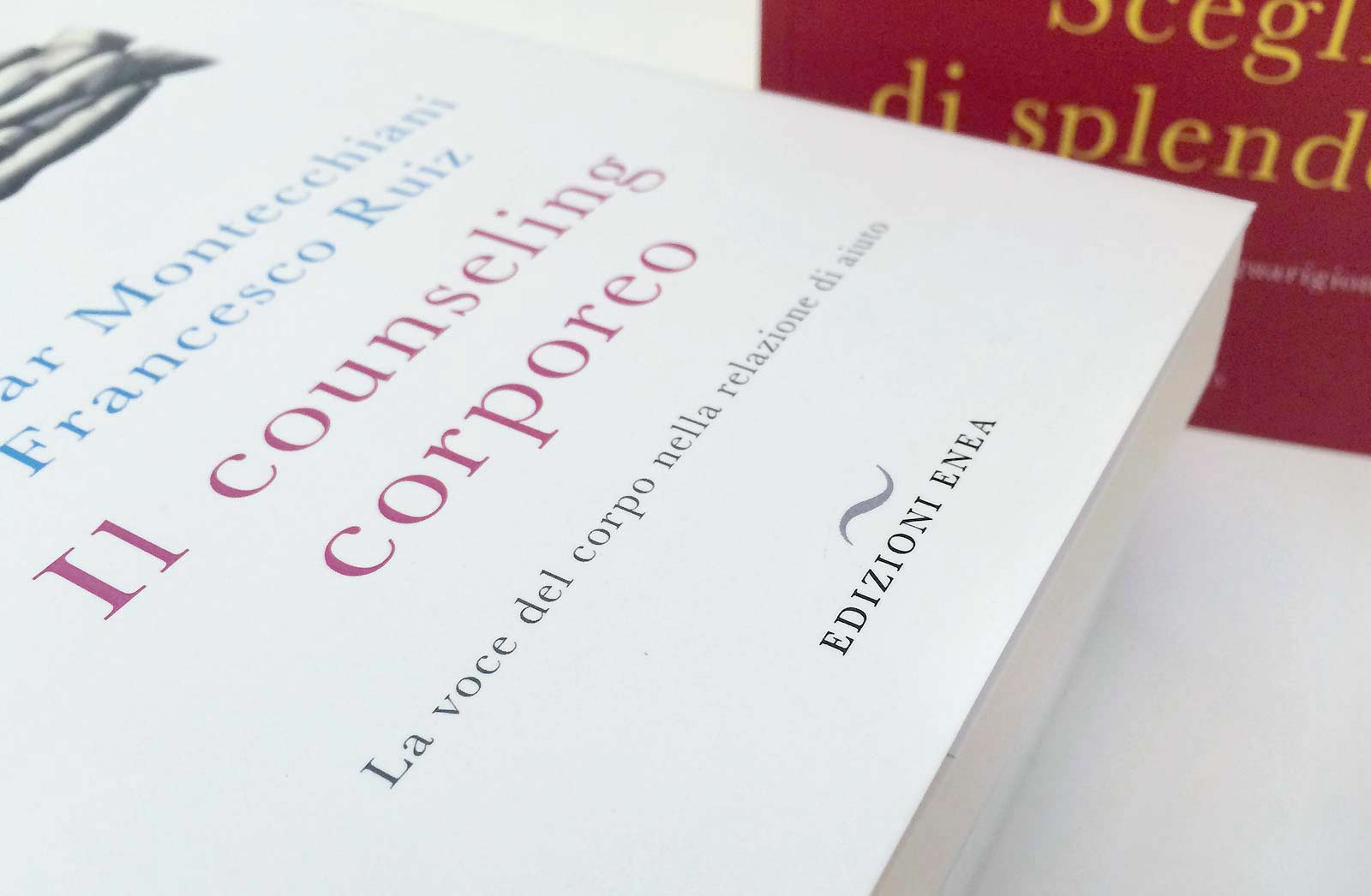
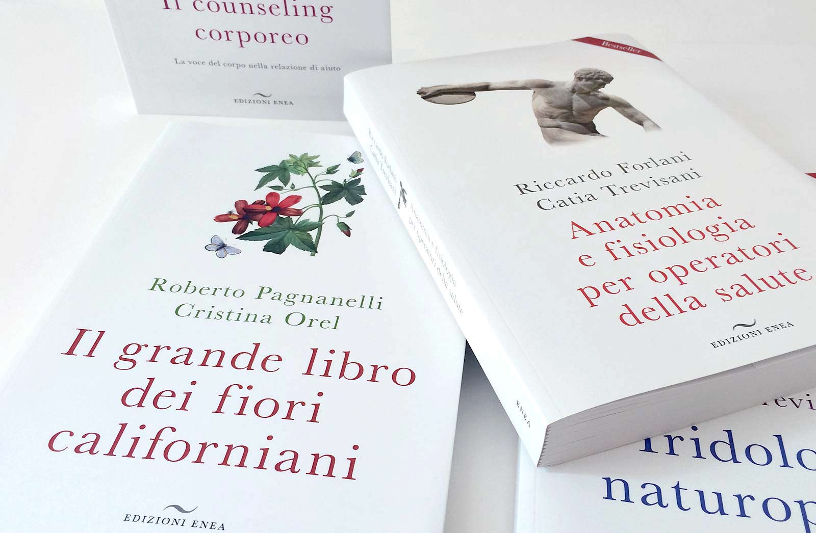
We were approached for a complete restyling of their brand image from the logo to the book covers. Edizioni Enea is a natural/alternative health publisher that works in synergy with their Holistic Medicine school: Simo. They publish study titles and they needed to branch out and start distributing on a larger scale.
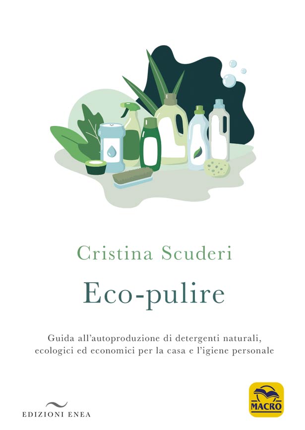
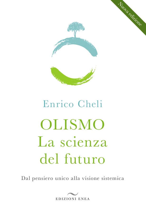
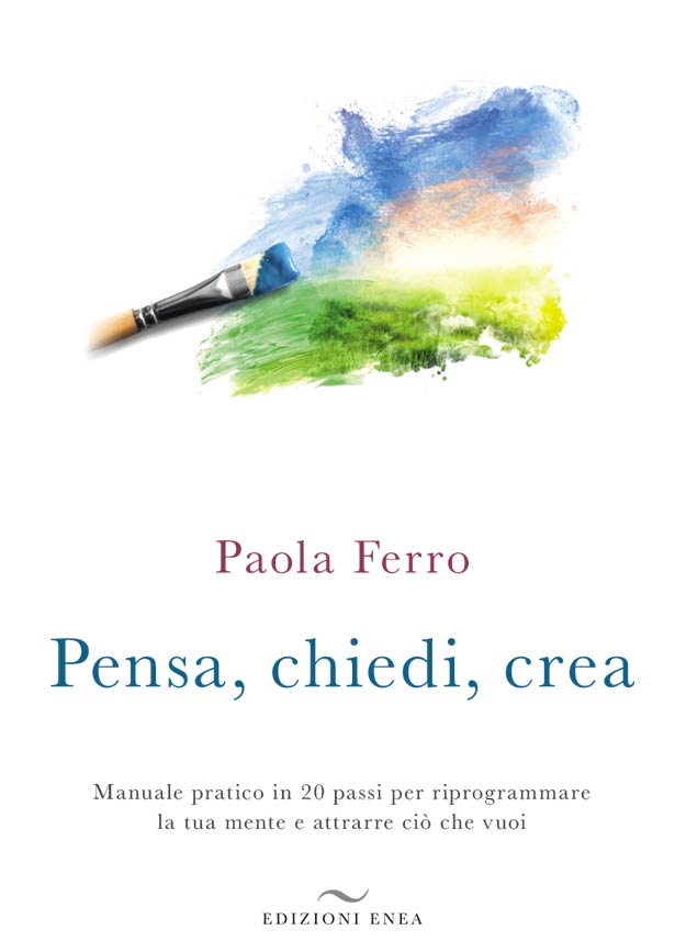
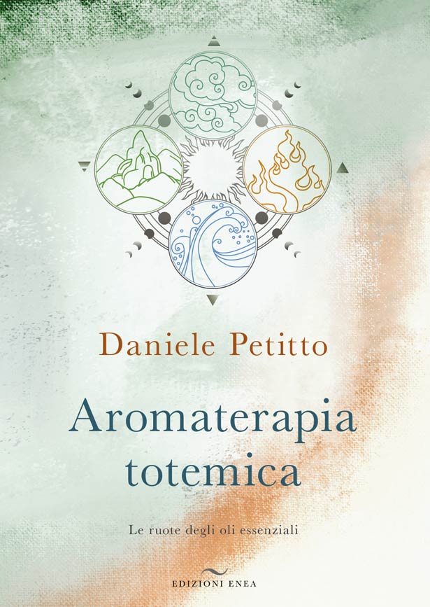
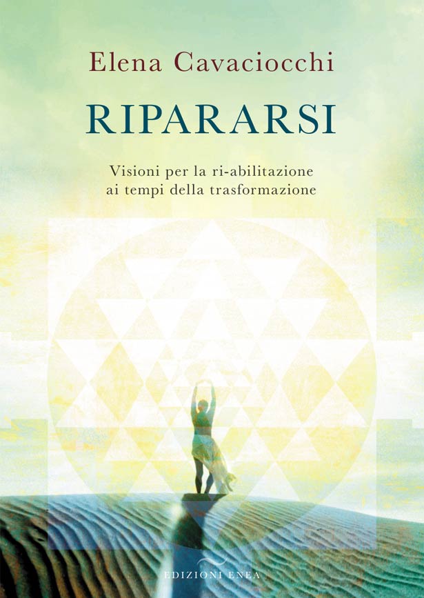
After an initial brand study, we developed their new logo with the air element in mind. The wind and the grammatical element tilde were our concept points. Eventually we began working on the new book series, they wanted a clean and rigorous look and feel. The books were not meant to go into the “new age” classification, they wanted to emphasize the content and author importance. We opted for a clean white background, and the use of an image that depicts the theme.
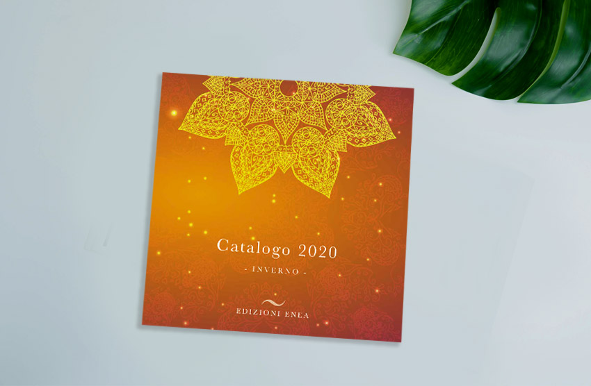
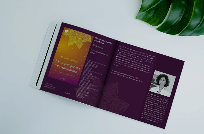
We’ve also provided a book interior design guide as well so all the books have coherent interior pages. Some of our other work has also been on all their cookbooks, their book catalog and at the moment we are Art Directing and designing all the new covers.